A talented Xbox fan created a mock promo showing a redesigned interface and a variety of custom themes, including one based on the Xbox 360’s Blades UI. Longtime Xbox fans will remember the Blades as the Xbox 360’s original dashboard when it launched in November 2005.
Xbox replaced the Blades with a new Dashboard in 2008, but many fans still have fond memories of the classic design. It remains popular today, and multiple fans have shared their interpretations of what a Blades-inspired Xbox Series X or Game Pass Dashboard would look like.
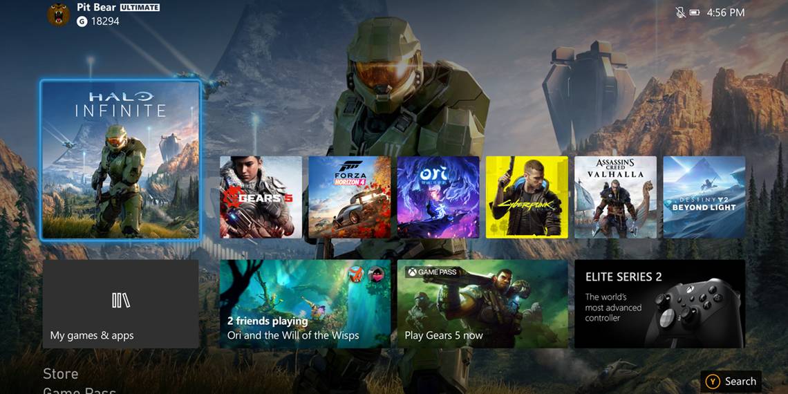
The latest example comes from YouTuber Zenkai Goose, who shared his Xbox Dashboard mockup on Reddit. Set to music, the 33-second video resembles an advertisement for the new user interface. The clip showcases the redesigned Dashboard, which features a background image with the user’s five favorite or most recent games displayed across the bottom. In addition, three small icons offer easy access to the Microsoft Store, search function, options menu, and messages.
Pressing Left on the D-pad opens the Quick Actions menu. This includes the Xbox Series X’s friends list, marketplace, news, achievement progress, and functions like shutdown and restart. Pressing Right on the D-pad opens Game Pass while pressing Up shows all notifications. Finally, pressing Down displays the user’s Games and Apps.
Zenkai Goose’s themes included backgrounds based on Fallout, Call of Duty, Redfall, and Bethesda’s upcoming RPG Starfield, in addition to the Blades-inspired design. Most are simply different background images, though the Blades Theme appears to contain additional interactive elements. This theme keeps Zenkai Goose’s basic design but features a box for the users’ Xbox Profile. It also moves the message notifications to underneath the Profile box and adds a Marketplace button where the 360 UI used to display Achievements and Gamerscore. The Blades Theme also shows tabs for Quick Actions, Games and Apps, and Game Pass, though a Notifications tab is conspicuously absent.
This is Zenkai Goose’s second attempt at redesigning the Xbox Dashboard, and he is not the only one fond of the Xbox 360 Blades UI. However, his current design proved polarizing on the Xbox, Xbox One, and Xbox Series X subreddits. Some criticized Zenkai Goose’s design, saying it was visually appealing but that the small buttons would make it hard to use in practice. However, others pointed out that the PS5 features similarly small buttons without issues.
Xbox gamers on Reddit were also split over the design’s use of space. Some fans liked seeing the background, while others felt that Zenkai Goose left too much unused space. Ultimately, it appears that everyone has their own ideas on improving the Xbox Series X and Series S Dashboard but can’t seem to agree on the main problems.