When a series goes on for a while, it can easily get stale. The developers may then change a few elements to renew the energy. These come in many forms, from gameplay to writing, but the most noticeable is the art style.
Several franchises completely switch their design mentality with sequels or reboots. This risks alienating fans attached to the old aesthetic, but certain series handle this transition with grace. Against all odds, they redesign their art styles while preserving the original's essence or finding an appealing new ground. Either way, they retain the love of their storied followers.
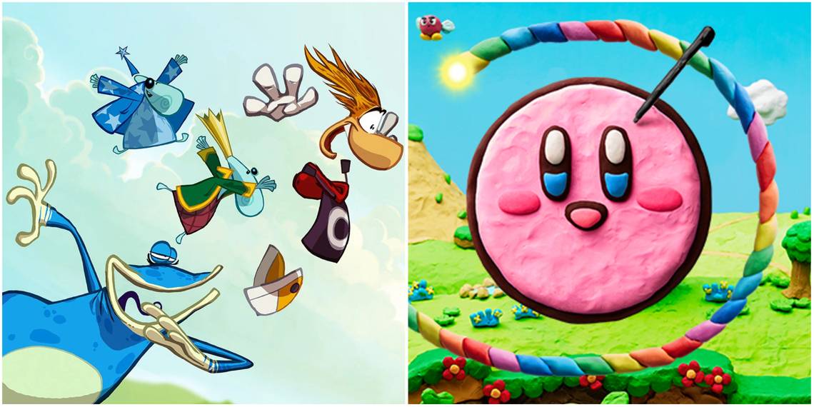
7 Rayman

The original Rayman was one of the most visually pleasing titles of the time. It had a wealth of animated environments which were deceptively cute given how hard the game was. Ironically, the series got easier once the art style became less friendly.
Rayman 2 and 3 darkened the palette and infused everything with zany mischief. It didn't go too gritty, but it was reminiscent of a twisted comic book. Following Raving Rabbids and its lackluster return to the earlier silliness, the series saw a brilliant blend of the two styles with Rayman: Origins and Legends. These restored the first game's vibrant colors while rife with the sequels' penchant for bizarre caricatures and off-kilter detail. Never has creator Michel Ancel's vision been so fully realized.
6 The Legend Of Zelda

The Legend of Zelda titles are all variations on the same basic premise: slaying Ganon and saving the princess/kingdom. What helps this foundation stay fresh is constantly changing the building blocks. Among them is the aesthetic.
The series has boasted several art styles throughout its run. There's the Saturday morning cartoon approach of older entries, the chibi look of Wind Waker and Link's Awakening, the noble painting appearance of Twilight Princess, and numerous others. Each title comes with something new in this respect, and these styles all suit the series. Not only are they pleasing to the eye, like a gallery of radically different artists, but they show the concept's malleability. The developers can mold it to fit virtually any style.
5 Final Fantasy 7

The Final Fantasy franchise has tested a plethora of art styles (with varying success), but the seventh mainline entry had a strong steampunk anime influence. This not only suited the mix of magic and science, but it aided in presentation due to the polygonal graphics. The game's popularity, however, meant that it soon transcended its PS1 roots.
FF7 saw several spin-offs and continuations, all pushing the world in a more photorealistic direction. The narratives definitely had a mixed response, but the graphics were never the issue. Rather, they maintained the vibrant wonder and cinematic quality of the original. This later culminated in Final Fantasy 7 Remake. Truly, Midgar has never been more eye-popping in its industrial scope.
4 Sly Cooper

Instrumental to Sly Cooper's classic noire tone were its comic book visuals. The characters all had angular designs, and the graphics made ample use of cell-shading. These cemented Sucker Punch's games as cartoonish capers.
Years later, the folks at Sanzaru Games emphasized that cartoonish quality when they brought the series back. Sly Cooper: Thieves in Time may have dialed down the noire, but it compensated by updating the animated aesthetic with modern systems. Rounded proportions paved the way for more detailed textures and expressive movements, particularly in cutscenes. The final product was a sillier affair, but it fit the tone of a time-travel romp.
3 Kirby

Most Kirby games have stuck to the same style. They all have a vague anime innocence. As a result, they make ordinarily stock locales as bright and vibrant as a Disney film.
That said, the series has sometimes experimented with craft-based designs, not unlike how Mario gave way to Paper Mario. Canvas Curse fashioned a world of crayons and paint while Rainbow Curse opted for clay figures. These may have been gimmicks, but they were still creative and inspired. No matter how successful, however, the Kirby games always come back to the familiar style, albeit going from 2D to 3D. They ought to branch out more often, as they've shown a real talent for it.
2 Castlevania

These spooky gems always aimed for the classical. The visuals seemed to stem from horror paintings and illustrations. It was standard, but it aided in the medieval atmosphere.
As Castlevania moved into the new millennium, though, it steered toward a Shonen anime direction. Entries like Dawn of Sorrow and Portrait of Ruin had casts seemingly stolen from Yu-Gi-Oh! and Pokémon. Their simplified designs made them more striking than previous characters, but they clashed somewhat with the gothic environments.
The Lords of Shadow reboots found a better balance. In every area, they strove for high fantasy with a sprinkle of Lovecraftian horror. This helped echo the series' roots while emerging far more operatic, beautifully translating Castlevania to a 3D realm.
1 Far Cry

The fundamental irony of Far Cry's art style is that it's virtually nonexistent. Every entry presents a photorealistic rendition of a familiar setting, be it the Caribbean, the Himalayas, Montana, or prehistoric times. The developers render these settings with authentic detail yet devoid of flair.
Far Cry 3 deviated from this with its expansion, Blood Dragon. This was a cybernetic sci-fi romp straight out of the '80s. Neon lights peppered the world and its mechanized inhabitants, and the cutscenes were still images akin to Super Nintendo titles. All in all, it was a feast for the eyes, creating an optical atmosphere infinitely more memorable than the mainline games. Why the publishers relegated it to DLC is a mystery.