Right now is an exciting time to be a Metroid fan. After several years without any major new titles, the drought will finally end in a little over a month with the release of Metroid Dread, the first true sequel in nearly 20 years. Anticipation is high for Samus Aran’s next adventure, so it’s no surprise that fans are taking the opportunities to celebrate past entries like 1994’s Super Metroid, like one who recently gave the game’s box art a neat makeover.
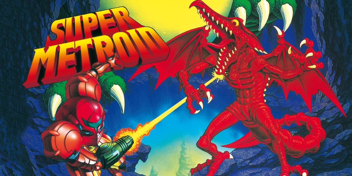
Over the 27 years since its initial release, the series’ third installment has gone down not just as a classic action-platformer and one of the best Nintendo games on the SNES, but a cornerstone of the wider Metroidvania genre its influence helped give rise to. As such, many fans look back fondly on the box art used for its North America and PAL release, which depicts a dramatically-posed Samus firing back at series villain Ridley while the monstrous Kraid looms behind the logo.
However, as Reddit user senseofphysics points out, how these characters are depicted here doesn’t exactly match up with how they are in the game itself. Ridley is the most noticeable departure, since the dragon-like leader of the Space Pirates is usually depicted as mostly grey or purple, but here is blood red from head to toe. Samus’ Power Suit, meanwhile, forgoes its traditional orange for a similar reddish hue. Remedying this, senseofphysics shared an edit of Super Metroid’s cover that restores both Samus and Ridley’s traditional coloring, providing fans with a more accurate version of their confrontation.
I slightly edited and enhanced the official Super Metroid box art. Ridley is at full health here, hence the purple, and Samus' colors are more accurate to the game. from Metroid
On one hand, the Reddit user notes that Ridley’s original depiction is somewhat faithful to Super Metroid, in that he does become increasingly redder the more damage he takes in the boss battle against him. On the other, though, senseofphysics’ edit does improve upon the official version by making it so Samus and Ridley no longer share similar coloring, allowing there to be a distinct contrast between the heroic bounty hunter and her archenemy. That said, it still doesn’t manage to explain why Kraid’s bottom half is floating kind of awkwardly above them.
Overall, the recolored box art has been met with positive reception among other members of the Metroid community, with several expressing how they’d never realized the correlation between Ridley’s red coloring and his declining health (though it’s unclear if that’s intentional or just to make Ridley look cooler to early ‘90s gamers). While fans have had to deal with some disappointing news recently with the shutdown of another Metroid fan game, other unofficial projects have allowed them to show their appreciation for Samus and her adventures. No doubt Metroid Dread will inspire even more in the months and years to come.