The quality of video games has come on leaps and bounds since the turn of the century. Even low budget games are now able to provide cinematic experiences while online multiplayer offers functionality that the gamers of old could only have dreamed of. Perhaps the biggest improvement though can be found in the graphics department.
While most modern games feature photorealistic protagonists, the graphical limitations of gaming's yesteryear led to some incredibly unusual looking character models. At the time, they were seen as cutting edge, but as technology has advanced, their jagged edges serve only as the relics of a bygone era. Most slowly fade away into memory, but there are some whose iconic designs linger on.
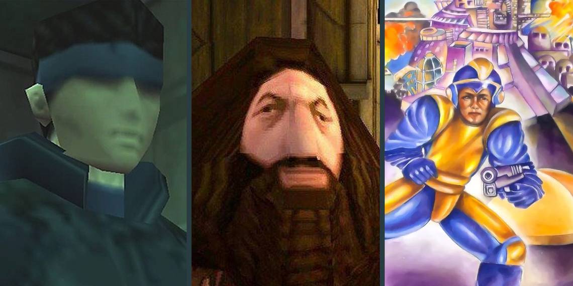
10 PS1 Hagrid (Harry Potter And The Sorcerer's Stone)

For a game whose main antagonist is an evil wizard who has committed unthinkable crimes, it's not surprising that Harry Potter and the Sorcerer's Stone has some frightening elements. Unfortunately, none of the enemies or obstacles that Harry encounters throughout the game are anywhere near as frightening as the game's cast.
Using textures to provide realistic faces was fairly common in the early days of gaming, but the developers seem to have had issues making sure that the models' heads were the right sizes. The distance between his eyes and the way that his face sinks into the mass of hair makes Hagrid the pick of the bunch, but all of the characters are comically composed.
9 Early Max Payne (Max Payne)

The range of facial expressions on display in Max Payne was fairly impressive for the time, but none of them really look quite right. Despite his strange looks though, Max's original appearance went on to become incredibly popular with fans and is somewhat iconic of the era.
Max's appearance in Max Payne 3 may have been significantly more realistic, but it is nowhere near as charming as the original design. The way that his face stands out against his low-poly hairdo made for some comical moments and being able to watch it fly through the air in bullet-time made them all the better.
8 The Man Of Melted Steel (Superman 64)

Superman 64 is a notoriously terrible game. It's boring, it's repetitive, and it's almost impossible to complete. Its only saving grace, perhaps, is its hilarious depiction of Superman. Given the quality of the game itself, it's not the least bit surprising that the character model turned out so badly. That doesn't make his appearance any less jarring though.
His elongated face can at times look like it's dripping off of his skull and the curly locks hanging across his forehead look more like a hair-dyeing calamity than actual hair. Together with the stiff wooden animations, Superman looks more like an action figure that's been left out in the sun for too long than the hero that we all know and love.
7 32-Bit Buzz (Toy Story 2)

It's clear that a lot of work went into Buzz's model in Toy Story 2. The detailing on his body is true to his original design and, with the exception of perhaps his wing cavities, all of the shapes and curves are as they should be. Unfortunately, that same attention to detail is lost when it comes to his face.
His huge, bulging eyes are the stuff of nightmares and his vacant expression makes him look like he's either drunk or contemplating an existential crisis. Had this not been a game designed for children and he himself not been a toy, this would fall squarely into the realms of 'bad.' Given the context though, it's absolutely fantastic.
6 Box-Art Mega Man (Mega Man)

Although regional box-art was fairly common in the early days of gaming, it was rare to see something quite like Mega Man. While PAL regions and Japan both received fairly standard box art, Capcom treated the North American market to an absolute monstrosity.
The depiction of Mega Man on the box was bizarre, hilarious, and downright scary. Although this version of Mega Man never appears in a Mega Man title, a similar version features as a guest fighter in Street Fighter X Tekken. It's not quite as strange but is still a far cry from the image of Mega Man that most gamers share.
5 CD-i Link (Link: The Faces of Evil)

When it first released, CD-i technology seemed like it may have the potential to rival traditional console gaming. That notion quickly went out of the window though as gamers got their hands on some of the abysmal titles that utilized it. How exactly Animation Magic was able to convince Nintendo to let them develop Zelda games is anybody's guess. Whatever the reason, Nintendo likely regrets giving them their blessing.
Although the characters don't look too bad when in regular gameplay, their depictions in cutscenes are downright awful. Link somehow looks worse than he did in the much-maligned Zelda cartoon and the Princess doesn't fare much better. Despite his terrible appearance though, CD-i Link has become an iconic reminder of why nobody but Nintendo should be trusted with this beloved franchise.
4 Double Oh No (GoldenEye 007)

Many regard GoldenEye 007 as one of the best multiplayer games of the '90s. While its gameplay was top notch though, its visuals were nowhere near as impressive. The blocky graphics were a byproduct of the era more than any kind of oversight on the developers' part, but they were and remain no less cringe-worthy.
Most of the character models for named characters are perfectly serviceable, but many of the game's Russian guards and soldiers are hilariously bad. The way that the facial textures wrap around the models makes for some bizarre results and some of the sharp edges make them look like they were cut-out using Microsoft paint.
3 Termina's Moon (The Legend Of Zelda: Majora's Mask)

It's not the design of the moon itself that's bad, but more the decision to give it a face. It's downright bizarre and incredibly cartoonish. In spite of this though, it really works. The way that it hangs in the sky drawing ever closer is incredibly intimidating and serves as a constant reminder of the impending doom that awaits.
Whether or not Termina's Moon can be considered a villain is debatable, but if it is, it's up there with some of the very best. Rarely are video game antagonists able to create such ominous tension and it's rarer still that one is able to do so by merely existing. It may look strange, but it helps make Majora's Mask one of the best games in the Zelda series.
2 Polygon Cloud (Final Fantasy VII)

The technology used to create 3D models in video games was very much in its infancy around the time of Final Fantasy VII's development. However, that's no excuse for the blocky, disproportioned character models of the game's main protagonists. Despite others achieving far more realistic results with much smaller budgets though, Cloud and his polygonal friends are infinitely more iconic.
Although some of the earlier Final Fantasy titles found success in the West, it was not until the series' seventh entry that it really took off. He may have fewer edges than a pair of Dungeons and Dragons dice and his arms might look like dumbbells, but the enigmatic soldier has become emblematic of the game's success and the impact that it's had on the gaming landscape.
1 Semi-Solid Snake (Metal Gear Solid)

Solid Snake is one of the biggest bad-asses in all of gaming. He has single-handedly taken on terrorist organizations and saved the world from death and disaster on countless occasions. That he was able to do all of this so effectively without a proper face makes it all the more impressive.
To be fair to Konami, the features are all there, but their ill-definition makes it look like Snake's face is starting to melt. He has shadows for eyes and his hair looks more like a hat than actual hair. In spite of all of this though, the design somehow works and its distinctive style still just about holds up to this day.