In recent years the Pokémon series has been really liking the idea of giving some of their older and more well-known Pokémon redesigns. This was first done back in Pokémon Sun and Moon with the Alolan redesigns and was recently done again with the release of Pokémon Sword and Shield with the games Galarian Redesigns.
Some of these designs were better done than others and some were just downright weird to look at, so let's go over the best and the worst of the Galarian redesigns!
10 Best: Darmanitan

Darmanitan kicks off our list as one of the best Galarian redesigns as it does everything a Pokémon redesign should do in order to be considered well done. This redesign is still obviously reminiscing of the design of the original version and you can tell that the Pokémon are connected in some way. This redesign also gets across Galarian Darmantian's new type, that being Ice, in a way that is obvious and even a bit funny, but still not too ridiculous.
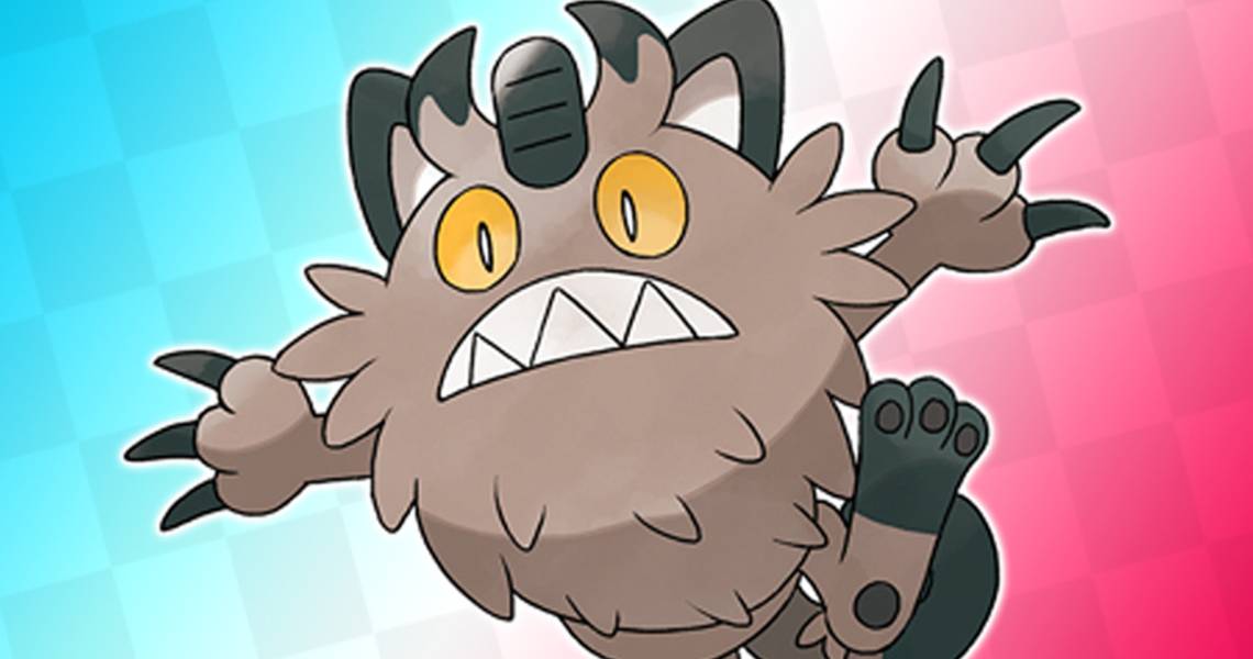
9 Worst: Meowth

Meowth is seemingly a favorite Pokémon of the design team over at GameFreak, as it not only has a Galarian version but also an Alolan and a Gigantimax form. It's clear that they really tried to do something different with the Galarian design and you have to give them props for trying but the Galarian version of Meowth looks more like the Tazmanian devil more than a cat. It looks like the furball a Meowth would spit out rather than the Pokémon itself and it doesn't get across the fact that it's Steel-type well.
8 Best: Zigzagoon

Sticking to furry things with our next entry. The designers of Galarian Zigzagoon clearly thought that simple was the way to go with this redesign and it works to a good effect. Galarian Zigazgoon is a Dark/Normal-type Pokémon and that comes through in this design. The change from a brown and grey color palette to a primarily white and black one gets across its new type while reminding us of the other version. The change of the pattern around its eyes is also a nice touch, as well as the reddish eye color.
7 Worst: Weezing

This version of Weezing looks like Doug Dimmadome from The Fairly Odd Parents, which just needs to be said from the start. Now that the important stuff is out of the way we can get into the details. This design clearly took some inspiration from old-timey factory owners or at least the depictions of them that we commonly see in media with the big hats and facial hair but it just makes it hard to take seriously that this is a dangerous Pokémon.
6 Best: Yamask

Yamask's Galarian redesign is another one that does the idea of making subtle but fairly noticeable changes well. Yamask in the Galar region is a Ground/Ghost-type Pokémon and the little change made to the make at the bottom of its tail does a decent job at showing that.
It also does a better job at foreshadowing what Galar Yamask will eventually evolve into than its standard counterpart. The best change was arguably made in the eyes, with the slight teardrop making it look so much more tragic.
5 Worst: Farfetch'd

Farfetch'd seemingly tried to keep it simple but just made it look silly with the one slightly major change that was made to its design for its Galarian version. Farfetch'd's Galarian form is trying to look edgier than its standard counterpart, with a longer leek and a darker coat of feathers. This is done to represent this version being a Fighting-type Pokémon but the problem is with its unibrow that makes it to hilarious looking to take seriously as a tougher fighter.
4 Best: Slowpoke

Slowpoke is a Pokémon that already looks pretty ridiculous and dumb and fro this particular Pokémon that's kind of the point. Galarian slowpoke only makes two additions to the original design. That being the addition of to yellow to the top of its head and its tail.
While it does kind of look weird and funny that is definitely the point, considering the Pokémon that we are dealing with, especially now that the Galarian version is only a Psychic-type Pokémon.
3 Worst: Corsola

The original version of Corosola is a very happy looking Pokémon, so it's possible that the designers thought it would be interesting to completely change that for its Galarian version. Corsola is, in its Galarian version a Ghost-type Pokémon, as opposed to its standard version that is Water/Rock type. This leads fans to think that it is the spirit of a dead Corsola, but either way, it's just kind of boring to look at, with its greyish and translucent form and more bored than sad expression.
2 Best: Rapidash

The designers seemingly said when they were making Rapidash's Galarain version "let's just do My Little Pony" and it somehow worked out really well. Galarian Rapidash is now a Psychic/Fairy-type Pokémon as opposed to being a Fire-type and it looks pretty good. It's still obviously a Rapidash with the original body more or less untouched but with the addition of actual flowing long hair and a legitimate unicorn horn, it just looks great.
1 Worst: Mr.Mime

Mr.Mime has always been a Pokémon that has freak people out, simply because most people don't like clowns, especially not since the release of movies like IT. So apparently the designers decided to lean into this even more by taking away most of the color from the design and making it look even more imposing and terrifying. The fact that it now looks even more like a scary clown while somehow also looking boring earns its place as the worst design on the list.