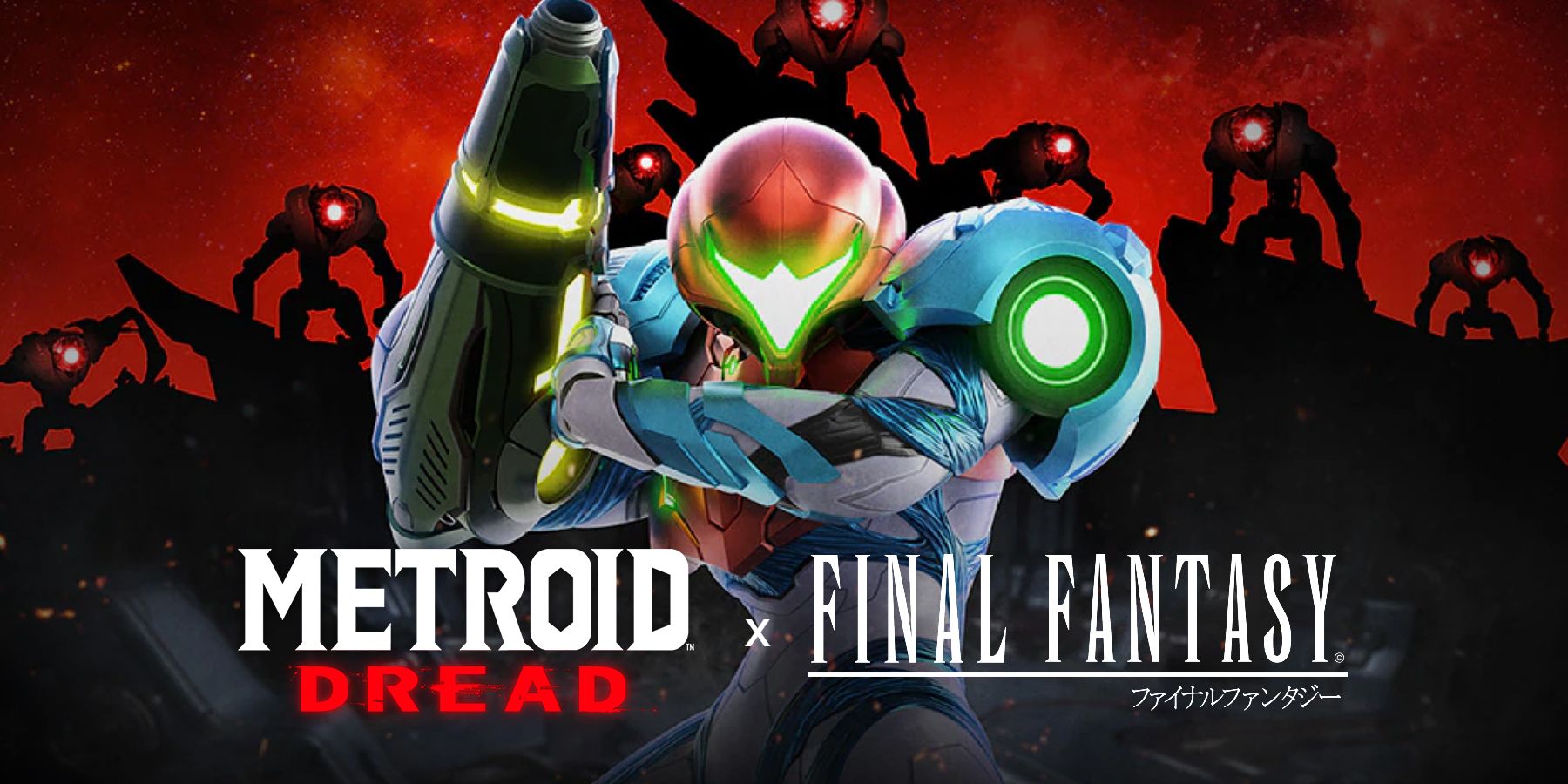
Metroid Dread's box art is simple yet foreboding, with Samus standing confidently in the foreground, while the seven E.M.M.I robots loom in the background. Another series known for its generally simple box art designs is Final Fantasy, and one has used inspiration from that franchise to redesign Metroid Dread's box art.
Going back into both Metroid and Final Fantasy's histories, fans will find evidence of consistently clean box arts. With Metroid, the focal point is normally Samus in the center of the art, surrounded by elements from the game itself whether it's enemies or environments. Take for example the last release before Metroid Dread, Metroid: Samus Returns, that simply shows a squatting, focused Samus, while the horizon of a planet and outer space appears behind her. Final Fantasy is similarly pretty simple with its design, in many cases simply selling a white box that has an enlarged version of the logo, with the attention being the eloquent icon set behind the text, like Final Fantasy 7 and the meteor.
Reddit user thedidynotkong recently shared their remake of the Metroid Dread box art in the style of Final Fantasy. There are two main connections to Final Fantasy in thedidynotkong's redesign: the color pallette and the design simplicity. Thedidynotkong does not reference Final Fantasy's usual color pallette specifically (it as mentioned typically being primarily white) but does the same technique as Final Fantasy, contrasting the logo artwork from the background through strong color work. In this case, thedidynotkong blacks out the entire background, leaves the text as is, and most strikingly, portrays Samus and E.M.M.I. in all red, really popping off the art.
As for the design simplicity, it is clear what effect thedidynotkong was going for. The placement of Samus and the E.M.M.I slightly above the title but still touching it evokes some of Final Fantasy's iconic logos and the work of Yoshitaka Amano, like Yuna and Sin on Final Fantasy 10's, or Kain Highwind on Final Fantasy 4's. From another perspective, thedidynotkong may have taken inspiration from the box art of entries like Final Fantasy 7 Remake, Final Fantasy 13, or the upcoming Stranger of Paradise: Final Fantasy Origin, that show one solid image contrasted by a stark white background. The red images of Samus and the E.M.M.I are recolors of official Metroid Dread renders.
Overall, thedidynotkong's redesign works as an extension of the original art, as well as a piece inspired by Final Fantasy. Keeping the color pallette to just those three colors of black, red, and white passively instills the same sort of intensity found in the original box art. Furthermore, without any sort of detail surrounding the characters, the design appears influenced by both the beautiful logo design of Final Fantasy, and also the staging of its more elaborate box arts. Other artists have attempted this crossover, like one who adapted the Castlevania: Symphony of the Night logo with Final Fantasy inspiration.
Metroid Dread is available on Switch.

