Intel is releasing the third iteration of its logo since its debut in 1968. The sweeping curve consumers recognize from the "Intel Inside" marketing campaign has been replaced by a more minimalist approach that adopts elements from both predecessors.
From the general tone of the announcement video, it seems Intel wanted to revise its brand while staying true to its history. By sticking to elements already present in its past branding, as Sony did with the PS5, Intel clearly aims to freshen up its look while still being instantly recognizable.
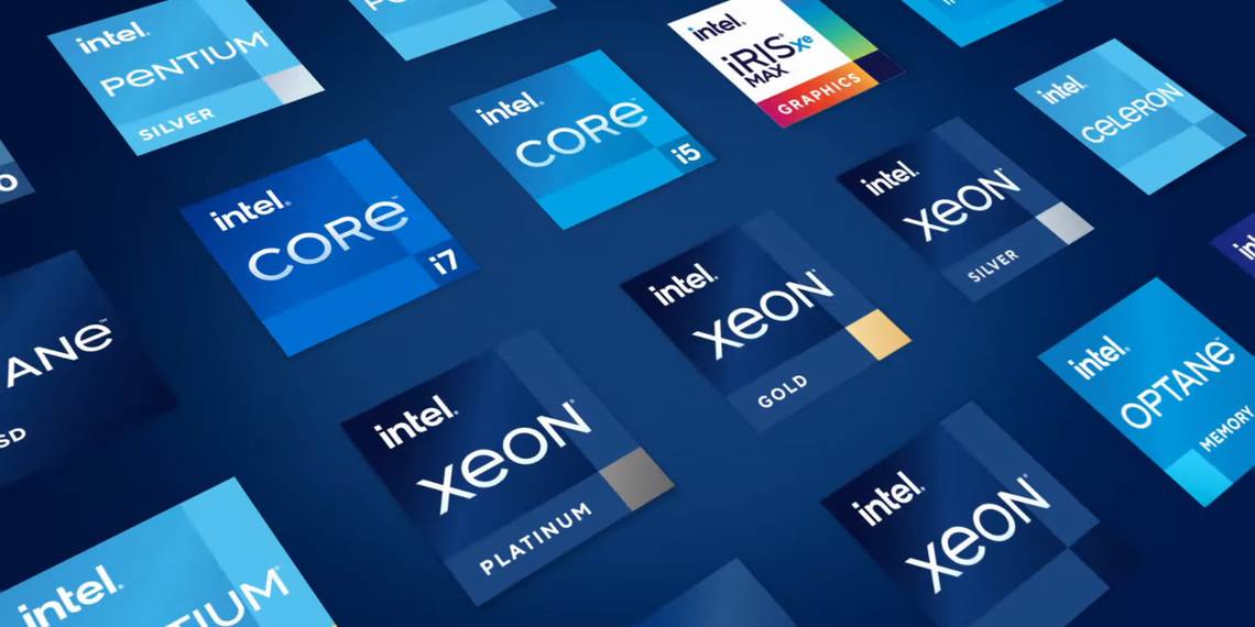
The company is keeping the pixel-square dot of the "i," and in some instances is choosing to accent it with a different color, preferably in its signature color scheme of Classic Blue and Energy Blue. The half-crossed t is lifted from the 2006 revision.
Minimalism continues to grow in popularity as a style, and can be considered a means of pushing back against societal forces which in recent decades heavily favored materialism.
Whether the decision-makers at Intel intended to play into consumers' 2020 existential crises or not is beside the point. The company is trying to prove to the world that its chipsets are a good deal for consumers, particularly the nearly half of gamers who favor PC. Their hardware decision making going into Holiday 2020 is likely to hinge on the balance between performance and cost, and consumers are expecting prices for next-gen titles to rise. By presenting itself as a manufacturer who sticks to the bare necessities, Intel's brand may become associated with low cost.
The announcement of the newly revised logo may be Intel's latest move to counter AMD's recent success in the stock market. This whole project is something that Intel could have kept waiting in the wings, waiting for just such an occasion to be deployed.