The world is a crazy place right now. Everywhere you look, some pretty stressful things are going on, and being stuck inside just adds to the fire. So, the release of Animal Crossing: New Horizons was a blessing in disguise for a lot of people, considering it's a game entirely meant for turning your brain off and relaxing. Most of the NPC characters are beloved icons at this point, and a majority villagers from past iterations have returned.
But, funnily enough, some of these villagers are stressing people out in a whole new way. When you start your island adventure, you get two new villagers to start things off, and it's a dice roll. You might get an amazing one like Marshall or a horrifying rodent such as Limberg. Watching the ways people have been trying to "banish" their unwanted villagers has been hilarious, so we're here today to talk about the worst of the bunch.
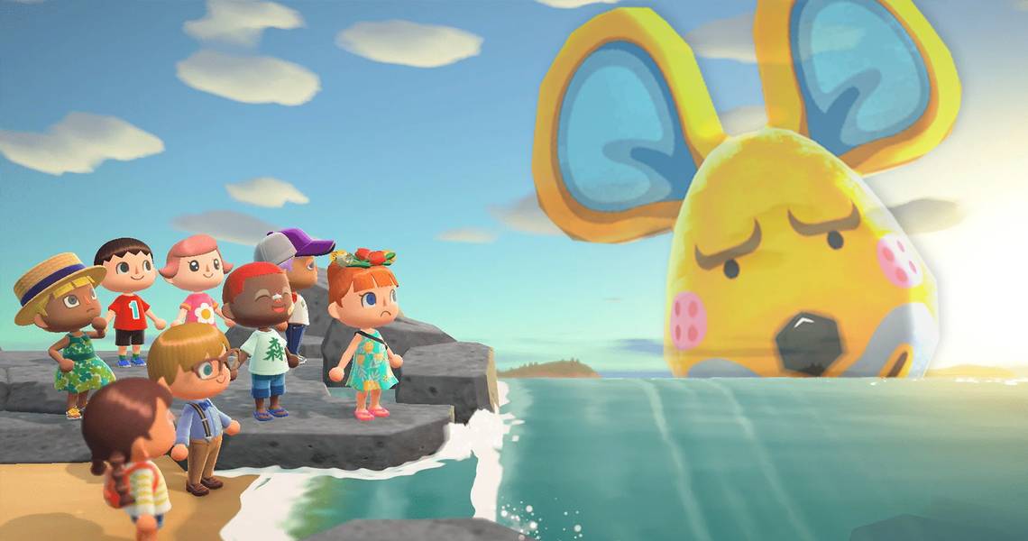
10 Limberg The Mouse: Nothing Matches!

Limberg is probably the AC character who's been getting abused most on social media. This bright yellow mouse has just the most contrasting design out there.
His head is misshapen, and not the same type of "round" that most cute characters have, his pupils are simplistic and would be fine on their own, if not for the exaggerated brows above them. His cheeks are rosy and cute, while his mouth has 5-o clock shadow and rough. And, to top it all off, his personality type is Cranky!
9 Chow The Panda: Don't Look At His Teeth

Chow the Panda is probably cute to some, and there are elements about him that are a little adorable. His slit pupils and squished features are uncommon for most Animal Crossing Villagers, even the ones from other video games, and the mole under his eye is more of a blemish than a beauty mark.
But, the detail in his design that throws most people off is his toothy smile. Most characters in the series usually smile without showing teeth or without even opening their mouths in the classic cartoony fashion, but Chow clamps all those pearly whites together when smiling at you.
8 Croque The Frog: A Daruma Done All Wrong

Croque's head is too dang big for his body, alright! If they wanted to use a Daruma homage for a Villager design, the guy should've looked like a big ball, or way more bulbous. But, instead, we get Croque, the eternally angry frog who makes references to his farts. If you're starting to notice the pattern of Cranky Villagers being the actual worst, don't worry, more are coming
Cranky Villagers seem to be designed as stereotypically unappealing, and that just doesn't work. Plus, Croque's house is meant to look like a forest with some Japanese influences, but the guy has a bonfire roaring inside his house!
7 Barold The Cub: Why Does He Wear A Tiger Striped Shirt?!

Barold is just an off putting design. He's like the stereotypical lazy "gamer" that the media liked to try and represent all throughout the late '90s. He loves to eat, which is common for bears, but one look at his house and you can tell the laziness is only for the sake of gaming.
Plus, those thick pink lips combined with his darker fur color bring forth the weird racist connotation that Japan is usually guilty of with characters like Mr. Popo in Dragonball or Jynx in Pokemon.
6 Cube The Penguin: The Lame Duck Of The Two Emperor's

Honestly, there are more potential penguin villagers than we ever would've expected in Animal Crossing. And, looking at all of them right now, most of them are pretty good. We know that Hopper is a fan favorite since he's based on an Emperor Penguin, and he made an appearance in the 2007 animated movie.
We also know that Roald looks shockingly similar to the Penguins in Mario 64 or Prinnies from the Disgaea series. But, Cube just looks so awful compared to the rest! Why does he have X-shaped Irises? Why is he also an Emperor Penguin like Hopper, but just looks so much worse?
5 Pietro The Sheep: A Nightmare For Us, A Delight Overseas

Did you know that the Japanese aren't really clown people? Thanks to serial killers and fictional monsters like Pennywise, American's tend to hate the makeup-wearing performers. But, the Japanese don't even have a word for clowns! They just call them Piero's, after the French Performer Pierrot.
Therefore, it's obvious where the name for the Clown-like Sheep Pietro comes from. Japanese audiences love him, but over here? Well, he's quite terrifying. His happy nature just seems off putting in that makeup, and those clashing colors are such an assault on the eyes. Seriously, thank goodness we don't see this Sheep get cosplayed at conventions.
4 Sprocket The "Bird": Sad That He Can't Get Swole

Sprocket is like Ribbot, but just worse. For those who don't know Ribbot, he's a mechanical frog, and one of the few animal creatures in Animal Crossing that technically isn't even an animal. Both of these mechanical dweebs are categorized as the "Jock" personality type, which is just so silly.
Why? Well, they're machines, and machines can't exactly lift heavy things to build muscle. So having to listen to Sprocket or Ribbot mention how much they love working out is kind of absurd. Sprocket would look better if his entire body was green, but for some reason only his head is.
3 Harry The Hippo: Just Plain Gross

Out of everyone on this list, Harry might be the most unappealing to look at. His skin color is like a mud-colored yellow or brown, and his beard/mustache doesn't really work for him.
He started out as a Jock personality in Animal Crossing for the Gamecube, but is now a Cranky type, as he apparently gave up on getting in shape. He might not deserve this much hate since he can be pretty nice in game, but his design is just awful compared to every other villager.
2 Rodney the Hamster: Just Look At That Hair!

Much like Cube, Rodney is just another example of the worst design in a series of surprising winners. The visual language for Hamsters in Animal Crossing is already unappealing at a base level, as these creatures look like they had normal proportions at one point, but got squished down. But, Rodney's features just make that base design even worse.
For one, he has hair on his forehead instead of the top of his skull! The dude has a bowl cut that comes out of his upper brow! Secondly, his oval-like eyes seem like they're trying to fight back against being squished down, which only adds more fuel to the fire. And lastly, he's a Smug type.
1 Derwin The Duck: A Neat Idea That They Didn't Commit To

And lastly, we'll end with a character that just seems inconsistent in almost every way. Derwin the Duck is another Villager that has reappeared in all of the games. He's a bright blue duck with large glasses, barely open eyes, and bright orange hair. You might think that since blue and orange are complementary colors, his design works. You'd be wrong. Derwin seems to be a play on Charles Darwin, the famous scientist.
But, if that's the case, why does he have a Lazy Personality? Why does his home in some games look like a museum, and then it others it looks like a normal home? Why doesn't he wear a lab coat or anything else scientific besides his glasses? Most of the other characters that are homages to folklore or historical figures nail what they were going for, Derwin just isn't one of those examples.