More often than not, an anime adaptation of a manga series is a cause for celebration. The story is now going to be exposed to a much wider audience, fans will get to see all the exciting moments they moved from the original drawings animated in color, and a chunk of the anime-watchers will then go and read the manga.
That said, some things do change in the adaptation process. And, one thing specifically is that a lot of times the actual art style of the manga or mangaka author is usually changed. So, let's look at some examples of series that have done this.
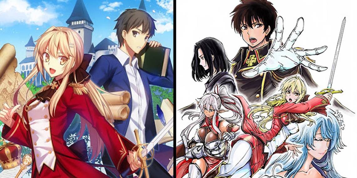
6 How A Realist Hero Rebuilt The Kingdom

First up is an isekai story called How A Realist Hero Rebuilt the Kingdom. In it, a young man by the name of Kazuya Souma is suddenly whisked away to a fantastical world, handed the position of King, and told to fix the country of Elfrieden for the better. Frankly, Souma does a fantastic job. But, the anime not only changes the pacing and line of events from the original light novel and subsequent manga, but it also has an entirely separate style from both of them as well:
- The LN artstyle has its own sketchy look to it and the characters and outfits tend to be more provocative and fan service-y.
- The manga has a more detailed and professional look to it, but the designs and art have this unique flair to them that make the characters look old.
- Meanwhile, the anime has a very stereotypical artstyle that isn't bad and also isn't great, it's just good. But, it lacks the charm of the LN style and the mature look of the characters from the manga.
There are fans that don't prefer one style over the other, but most of them tend to have one they adore and the anime is usually not it.
5 The Saga Of Tanya The Evil

Youjo Senki, otherwise known as the Saga of Tanya the Evil, is an interesting case. This story, like Realist Hero, originally started as a light novel, then a manga adaptation six years later, and finally an anime adaptation three years after that.
And, along the way, fans developed extreme opinions on each of the three mediums, considering they all had different artists and directing. For example:
- The source material LN has a lot less action and a lot more explanation of Tanya's plans or her monologues. And, when there is art, like in the volume covers, the style is incredibly detailed, and colorful, plus the proportions of characters are more realistic.
- In comparison, the manga is much more balanced with action scenes, political scenes, and monologuing, but its highly stylized (even more than the LN), and a lot of the backgrounds and background objects are in a realistic art style while Tanya and the other characters are not.
- Then finally, the anime is generally regarded as good but has the fastest pace overall with an artstyle that blends the stylization well with the realistic aspects.
Overall, the general consensus seems to be that the manga is the best middle ground for both art style and writing.
4 Gate

Yet another example of a series that started as a novel, became a manga series, and was eventually adapted into an anime. And, out of everything so far, Gate probably has the most differences between the art styles of all three mediums:
- The novel's art is very stereotypically mainstream anime in its art style but is still a few steps removed from the style of an actual anime character.
- The manga's art style is absolutely the most polarizing as the line work is intentionally rough, much grittier in the violence, and has a ton more fan service. The character's facial features, in particular, look a lot different from the LN or anime.
- The anime basically made the art a lot more modern. The character's eyes are bigger, they're more colorful, and their proportions are a lot different. In fact, if someone looked at Shino Kuribayashi's design in the LN, manga, and anime, she looks by far the youngest in the anime.
None of these are "bad" art styles by any means, and they all have their own unique pros and cons.
3 Bungou Stray Dogs

While the art style differences between the Bungou Stray Dogs manga and anime are noticeably enough to warrant it being on this list, it's sort of the middle-of-the-road example.
And, the reason for this is simply because the anime is mostly faithful to the style of the characters in the manga, but not the style of the art itself. To elaborate on this a bit more:
- The manga's artist, Sango Harukawa, obviously has a lot of love for character designs and isn't the most enthusiastic background artist. The majority of the face-to-face talking scenes in Bungou Stray Dogs have almost no background behind them with the characters talking in white space. For dramatic moments especially, this choice makes them so much more impactful.
- Meanwhile, the anime streamlines the style a bit while also including a lot more background work. Otherwise, the style is mostly the same save for a bit less detail work so that the characters are easier to animate.
To be fair, the difference between the two versions of the story can be found in a lot of different anime adaptations, as these moments of white space or harsh black and white contrasting moments work well on paper but not so much when animated.
2 Jujutsu Kaisen

This next example is one where the differences between anime and manga are completely up to the individual as to whether one is better or worse and why.
- The Jujutsu Kaisen manga, by one Gege Akutami, has an intentional "rough" line-work style to it that adds a lot visually to the chaotic moments. It's clear that Akutami has a really distinct way of drawing specific things like hands, eyes, and even gore. And, as the manga goes on, his art becomes even more stylized and rough in a way that gives JJK and it's different unique Jujutsu powers their own identity. For comparison, the closest comparable thing would probably be Sui Ishida's style with Tokyo Ghoul.
- In comparison, the Jujutsu Kaisen anime is a lot more "clean", as it sort of has to be. It's not that anime can't have these super-unique styles to them, as people have seen with stuff like The Ranking of Kings, but Mappa chose to stay as faithful as possible to the manga while keeping a cleaner line-art style and doing more with the backgrounds. For a perfect example as to why they made this decision, just look at the popularity of the Jujutsu Kaisen 0 movie. That said, they obviously want to keep it as close as they can to Akutami's style, and this can be seen especially with how they've done the effects for certain Exorcism Jujutsu techniques like Itadori's.
1 Made In Abyss

Funnily enough, for as beautiful as the Made in Abyss fantasy world is in the anime, the actual source material didn't put nearly as much detail work into the backgrounds or environmental art of the Abyss itself. To compare the two:
- The MiA manga has a lot more detail in the character's outfits, the knick-knacks they have on their clothes, etc. There's a lot more polish put on the characters (especially the talking animal-like characters such as Nanachi or Faputa) compared to the backgrounds. Additionally, the action scenes, especially the movement-heavy ones have a much stronger sketch-like quality to them to give off this "inhuman" aspect to them.
- Meanwhile, the anime has some of the best background work in years. Each panning shot of the Abyss itself or the environments within it is awe-inspiring (or horrifying, depending on the layer). While, in contrast, the character art is just alright. It's faithful to the proportions and overall look of the manga, but the expressiveness of the characters and their details are a bit lacking.
And let's not forget the newest game that came out as well, Binary Star Falling Into Darkness, which is beautiful in an entirely different way.