With its full specs delineated at E3 2012, a launch lineup having leaked through Gamestop, and a November release date looking ever more likely, Nintendo's Wii U filled in another puzzle piece today: box art.
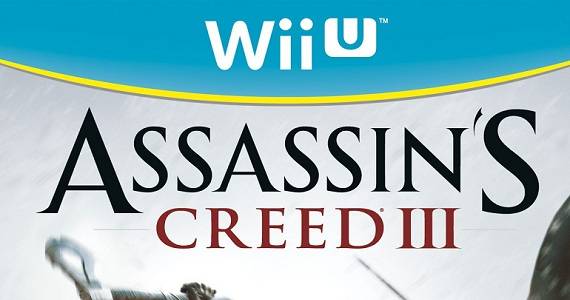
Assassin's Creed III, Just Dance 4, and Marvel's The Avengers: Battle for Earth have provided us with our first glimpse at the Wii U's upcoming cover designs, thanks to a (now-deleted) posting on the Canadian branch of Amazon. Shortly thereafter, retailers Target and GameStop listed three-dimensional box art for AC III and FIFA 13 showing a light-blue casing that comprises the box's exterior.
Nintendo has yet to confirm the aesthetic authenticity of the images, but with identical postings spanning a several retailers within a matter of hours, it's safe to rule out arbitrary placeholders or Photoshop.
[UPDATE]: The cover art has now been confirmed. A Ubisoft PR rep (the original aforementioned design leakers were all Ubisoft games) reached out to Gametrailers, calling the art "legit....too legit to quit."
[gallery order="ASC" exclude="162042, 162043" columns="2"]
Depending on your age and experience with the Nintendo brand, the Wii U cover designs might appear refreshingly reinvented or invoke a throwback vibe. A centered semi-circle stripe bands around the top bearing the Wii U logo. It's turquoise background, a thin yellow-gold trim marking the edge, adds bright splash of color to what was a white, right-adjusted tab on the Wii's game box. Also, not scrubbing the chance to advertise the all-new Nintendo Network, a light-orange insignia for the service adorns the top right corner to signal online compatibility.
At the same time, though, the overall design appears oddly GameCubian.

Every aspect of the Wii U box's front label arc, from the size to the shape to the thin finishing trim, is indistinguishable from its pre-motion-era ancestor save for coloring and the name. One change, comparing from the Super Mario 64 box above, occurs on the the spine - the Wii U logo emblazons the top where the GameCube logo sat on the bottom third - but the similarities are still striking. We'd be surprised if the symbolism wrapped up here wasn't meant to reclaim some of Nintendo's hardcore base: fans who migrated to different platforms after the diverging direction of the Wii - and for whom Nintendo nostalgia still evokes some fond gaming memories.
Ranters, what do think of what appears to be the design for Nintendo's Wii U box? Does the fresher color scheme blend well with the classic Gamecube motif?