
Many nuances of game development go unappreciated by players out of necessity, but good HUD design is one of the most easily ignored. We use and interact with heads-up displays constantly, so a good HUD design is one that is largely invisible—we find the things with need naturally rather than having to search for them.
Bad HUD design, on the other hand, sticks out. We remember when we can't find the minimap or our health bars are too small, too big, or entirely nonexistent, or when the screen is cluttered with useless information, blocking our view of the game itself.
So what goes into designing a proper HUD? It's a mix of anticipating user needs, maximizing user experience, and doing so in an aesthetically pleasing manner without obstructing the crucial view of the game. It's a pretty tough balance to achieve, and even some good games struggle with HUD design.

Bad HUD Design Takes Up Too Much Space
When you're playing a game, it's imperative that you actually be able to see the game. This is one of the places where many games fail in the HUD design department, as they try to give the player more information than they need in a given moment. Another cardinal sin of HUD design is making things too large—while we certainly like to see our health bars and minimap, they shouldn't be eclipsing our view of the game.
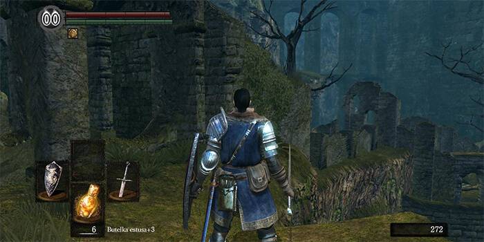
Despite being an all-around amazing series, From Software's Demon's Souls and Dark Souls are particularly frustrating examples of HUD design. Your items take up a huge amount of space on the screen, with large icons representing your Estus Flasks, weapon, shield, and equipped item. To round it out, your health and stamina bars sit at the top of the left side of your screen as well, giving far more weight to that side and making it all feel a little unbalanced—while the game is intentionally difficult, that challenge shouldn't be coming from HUD design.
The same is true of Far Cry 3, where intrusive HUD design marred the beautiful landscapes and prompted some players to want to remove it entirely. Ubisoft patched the game to allow players to customize the HUD to their liking, which is usually the best method of dealing with clunky HUD design. Letting players click, drag, and resize the important elements allows them to structure things how they like it.
A Good HUD Design Should Appeal to Intuition
A good HUD's primary objective is to provide the user with information quickly, efficiently, and with minimal effort on the part of the player. Our eyes should be drawn to the crucial information without having to search for it, but accomplishing that goal is easier said than done.
One of the most effective methods of drawing the player's eye is color—that's part of the reason that health and stamina bars are usually bright colors—but developers can easily go overboard with drawing the eye. For instance, in Street Fighter X Tekken, the HUD featured multicolored health bars with sparkles, flames, huge portraits, and a heavily stylized font. In fighting games, which rely on reflexes for success, those elements can be huge distractions, drawing your eye away from the game. While players can learn to ignore distractions, that's no excuse for poor HUD design.
The problem with all the sparks and lightning is that, while they certainly draw your eye to the right place, they're drawing it there too frequently. A good HUD should be something you use when you need it, not something that pulls you out of the game.

Function and Immersion Meet in Good HUD Design Aesthetics
Aesthetically pleasing HUD design is a little harder to get right, as it’s a far more subjective concept than taking up too much space or being distracting. While fitting into the theme of the game shouldn't be all that difficult, over-designing a HUD can lead to distraction rather than immersion.
Metroid Prime is cited amongst the best of HUD design, and for good reason—it's immersive, intuitive, and suits the game perfectly, as you really feel like you're inside Samus' suit. This is HUD design done right, providing the player with exactly what they need and want to see, without relying on sparkles and lightning bolts to make it fancy.
Thankfully, for games that lack good HUD design, modders come to the rescue. While modding isn't readily available for console players, there's a HUD modification for just about every game, allowing players to make their own compact, intuitive, and aesthetically pleasing designs for just about every game. HUD mods are especially popular in MMOs—World of Warcraft has over 120 addons on Curse for HUDs alone.
While a bad HUD won't destroy a good game, it can be a distraction. Designing a good HUD is difficult, but it's also hard to recognize a good one when we see it, precisely because they're usually designed to aid the player through the game, not to draw attention to themselves. But a really good HUD design shows just how much effect putting a little more thought into the design can have.
What are your best and worst examples of HUD design?